Technology has become an essential part of people’s lives and offers new opportunities to improve everyone’s life. Some solutions are used in modern business as well as general design.
According to report, about 7.53 billion people worldwide, 4.48 billion of whom use the Internet. That is, 58% of the population can use the Internet when necessary. This is an exciting number in many ways.
Out of the world’s population, 1 billion people have special needs. Some types of disabilities make it difficult to use certain content and may require these people to use assistive technology and advanced features in their daily lives.
However, people with disabilities cannot use the content on the website if it does not comply with the principles of web accessibility. These users are missing out on the opportunities that technology provides. All users must have access to them.
What is Web Accessibility?
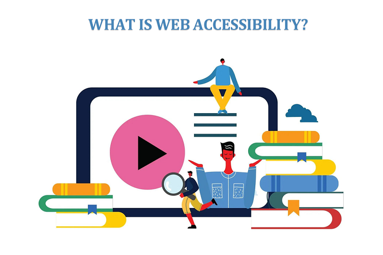
Web accessibility is how websites are used by all visitors, including people with disabilities, disparities, and impairment. The web accessibility includes following some basic design to ensure that people who face difficulties or limitations have the same or similar experience as those who do not. Accessibility is a fundamental goal for websites because it gives everyone equal access to your content.
When we talk about web accessibility, we are talking about digital usability, as the same principles apply to mobile phones and other digital products.
In general terms, digital accessibility ensures that your website and mobile devices are accessible to everyone, regardless of barriers. If the material can be found in any appropriate direction, providing that you do not exclude people with visual, hearing, motor, or cognitive impairments from your content.
With an improved layout and design, the web interface provides a user-friendly experience for everyone, even if they cannot use their hands and have to type with their mouths, the ability to listen well and rely on information when watching online videos, the ability to see well and use a reader with screen to read aloud what is on the screen, or to have various age-related impairments such as cognitive decline.
But people with disabilities aren’t the only ones who benefit from using the Internet effectively. Websites designed with usability work best on older devices and are easy to use even on slow internet connections such as Here are a few examples.
According to 18F, the US government’s computer agency, usability is one of the most important aspects of modern web development, which includes web design: “Accessibility means a more significant number of users can view your content. It tells search engines will be able to read your entire website. Users of all types You will have a better knowledge if you consider the concerns of the space.
Importance of Web Accessibility
The Internet is an increasingly important resource in many areas of life: education, work, government, business, healthcare, entertainment, and more. It is essential that the Network is accessible to provide equal opportunities for people of different abilities. Access to information and communication technologies, including the Internet, is a human right in the United Nations Special Convention on the Rights of Persons with Disabilities (UNCRPD).
The Internet offers the opportunity for unprecedented access to information and communication for many people with disabilities. It can be easier to overcome the barriers available for print, audio, and visual with the help of web technologies.
Web accessibility supports the social integration of people with similar needs, such as older people, people in rural areas, and people in developing countries. There is also a strong business case for this possibility. Ease of use improves user experience and satisfaction, especially across contexts, devices, and seniors. Using it can enhance your brand, drive innovation, and expand your market reach. Online access is required by law in many cases.
Principles of Accessibility
Web accessibility principles are the basis of what is created for the web and anyone who wants to use the web. These guidelines are called POUR, which is an acronym for operational efficiency:
Perceivable
Perceivability refers to information and user interface elements that must be presented in such a way that the senses can perceive them, and there is nothing left that cannot be seen or seen. For most web users, navigation is based chiefly on sight, but for those who can’t, voice and touch are used.
Operable
Interactive UI elements such as controls, buttons, navigation, etc., should be functional. This means that the user must be able to work with interactive features by first identifying them and, in most cases, by physically clicking, tapping, swiping, or swiping. For those who cannot interact in this way, voice or using other assistive devices such as headsets and monitors.
Understandable
This means that the technology must be clear and consistent in presentation and structure, with defined patterns of use and design. End users should have no problem understanding the meaning and purpose of the information presented in the content while browsing, understanding the application’s use, and the enterprise’s operation.
Robust
Robustness is the content’s ability to perform reliably across various technologies, including assistive devices. Therefore, lacking one of these four principles will make it impossible to access the Internet for people with special needs.
How to Make Your Website Accessible
After studying the above principles, you may have realized that your site is unsuitable for these conditions. Or maybe you tested your website with a free testing tool, and it didn’t show the best results.
It is essential to create websites that are accessible to everyone, including people with disabilities. By following some simple guidelines, you can ensure that as many people can use your website as possible. Below is a list of things to consider when designing a free website.
Ensure your site allows keyboard navigation
One of the cornerstones of an accessible website is the keyboard layout. To be considered accessible, people with special needs must be able to navigate your site without a mouse. This is because many assistive technologies rely on keyboard navigation. Therefore, you must ensure that users can navigate and search your website using only the keyboard. This includes accessing pages, clicking links, and more.
Providing text transcripts and captions for audio content
While providing users with a richer and more varied online experience, can limit the ability of people with hearing impairments to see. Providing text and subtitles for audio material, such as radio interviews, or adding audio content information to sign language can help overcome these limitations.
Give your content a proper structure
To navigate content, screen readers use HTML headings (H1, H2, H3, H4, H5, and H6). With the proper use of HTML headers, you can make life easier for your site’s visitors with disabilities who can’t read text displayed on a computer screen. Well-organized content serves the interests of search engines, so it’s a win-win situation for everyone.
Use high-contrast colors
Some users may have difficulty seeing text when the color contrast is light. Therefore, we recommend using colors with high contrast, such as black and white or black and yellow.
The contrast of colors on your website should ensure that all elements on the page stand out. For example, the text should stand out, not blend into the background. Several online tools will help improve your visibility.
Provide ample time to engage with your website
Allow users to read, view, and use different types of content on your site within a reasonable amount of time. If any activity on your site involves a time limit, users should be able to extend or cancel it. This strategy also applies to menus available below: if the user opens the menu from the mouse, it is a good idea to set a time delay a’ the list doesn’t disappear in case it suddenly gets bogged down.
Design forms carefully
Forms can be complicated for some users, so it’s crucial to design them carefully. This includes ensuring that each sign is clearly labeled and that the document is easy to navigate.
For example, you may want to place checkmarks next to relevant fields. It’s also wise to include short instructions that let users know exactly what they need to know to fill out the form correctly.
You can also enable people to enter information displayed in the form and user templates. Thus, they better understand how to fill out the form.
Display an accessibility statement
Show your customers and partners your commitment to online marketing efforts by posting a vacancy statement on your website. The access statement should include the guidelines and guidelines that your website will follow, including the expected level of access, contact information, checking if visitors have problems connecting to the site, and verifying any issues with the parameters. You can use the user interface to create a complete and convenient application quickly.
Last Words
The continuous improvement of the web accessibility is a cause for joy. After all, if you’re running a WordPress website, you probably want to reach as many people as possible, including people with special needs or disabilities. Luckily, designing a website with usability in mind just got more accessible and more effortless.
By providing access to your website, you are doing what the people who matter most to your business—your visitors and customers—need to do. Be sure to use the tools listed above and review the examples we’ve listed for inspiration when hosting your site.


+ There are no comments
Add yours