The Excel 2013 Quick Analysis tool lets you apply conditional formatting to a range of cells, as well as turn that ranges into a chart, table, or PivotTable. With the Excel Quick Analysis tool, you don’t even have to use Ribbon to do what you need to do. It can all be done quickly and easily—with just a few mouse clicks. Here’s how.
Examining the Quick Analysis Tool
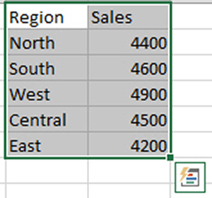
The Quick Analysis tool becomes active when you use your keyboard or mouse to select a range of cells in a worksheet. (The selected cells must contain data; Quick Analysis isn’t available—or needed—for an empty range.) Position your cursor over the bottom right corner of the range and you see the Quick Analysis button. Click this button (or press Ctrl+Q) to display the Quick Analysis gallery.
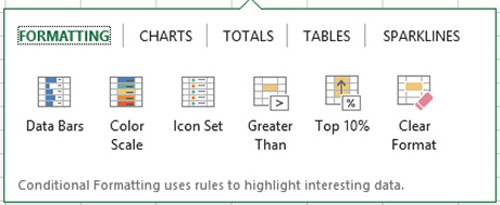
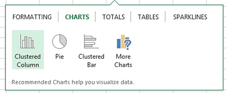
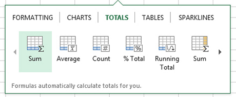
The Quick Analysis gallery presents five tabs for different actions: Formatting, Charts, Totals, Tables, and Sparklines. Click a tab to view the available actions, which may differ somewhat based on the type of data selected.
The nice thing about the Quick Analysis tool is how easy it makes using some of Excel’s more advanced functions. Not only does it place the appropriate creation commands in a single place, it also previews the results before you apply the commands. You don’t have to surf Excel’s various Ribbons to do what you want to do; chances are, it’s right there in the Quick Analysis tool. And you’ll only see those options that are appropriate to the data you’ve selected. That makes the Quick Analysis tool a smart tool for any Excel users.
Conditionally Formatting Data
The Formatting tab in the Quick Analysis gallery enables you to apply conditional formatting to the selected data. So, for example, you can apply data bars, different background colors, or even different icons to cells within your range that meet specified criteria. You can also choose to highlight cells that are greater than average or are in the top 10% of values.
Creating a Chart
Use the Chart tab in the Quick Analysis gallery to quickly create the most common chart types from the selected data. The tool recommends a handful of chart types most applicable to the data in your range. Mouse over a chart icon to see a preview of that chart type, then click the icon to create the chart beside the selected range. To create other chart types (beyond what Excel recommends), click More Charts to open the Insert Chart dialog box.
Calculating Data
When you want to perform basic calculations of the selected data, select the Totals tab. From here you have the option to apply common functions—Sum, Average, Count, % Total, and Running Total—on either the columns or rows in the range. The results of the calculations are displayed in the row beneath or column beside the selected cells.
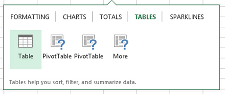
Creating a Table or PivotTable
As experienced Excel users know, there’s a lot of power in that old spreadsheet program—and much of that power comes from the way data is organized and managed. Depending on the type of data in your worksheet, you may want to create a table to treat that data as a database, complete with records and fields, or as an interactive PivotTable that you can easily manipulate to analyze the core data in different ways.
The Quick Analysis tool enables you to quickly create either a database table or PivotTable from the selected data. Select the Table tab and you’re presented with options to create a data table or various PivotTables. Mouse over the table or PivotTable icon to preview the resulting creation; click an icon to convert the data to the desired table or PivotTable.
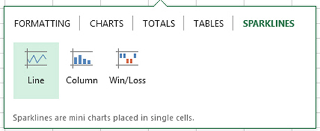
Analyzing Data with Sparklines
Then there are sparklines, which were new to Excel 2010. A sparkline is a kind of mini-chart, embedded in a cell next to the selected data, that visually displays the trend in the selected row or column. A sparkline can literally be a line (in the form of a line chart) or a column or win/loss chart.
Select the Sparklines tab in the Quick Analysis gallery to see the available sparklines. Mouse over an option to preview the results; click an icon to add the sparklines to the next column over from the selected data.
Now that you know how to use the Excel 2013 Quick Analysis tool, it’s easier than ever to organize your data.