Stationary PCs are no longer the only source of information. Being on the move the user also seeks to be aware of everything necessary that the global network of the Internet has to offer. The current situation is such that the relevance of mobile versions of the resource becomes undeniable. Over the past decade, mobile gadgets have moved from being a “luxury item” to a “must-have” category. Commercial resources must be responsive to such changes in order to maintain conversion rates. The mobile version of the site has become an inseparable part of ANY online platform selling goods or services.
Eighty percent of people who visit the Internet are smartphone owners. Even customers who visit from a desktop computer may do so from their phone the next time they visit. And remain dissatisfied.
The problem is that the display of the gadget, even the most advanced, is quite small compared to the monitor of a desktop computer or laptop. And it can not accommodate the same amount of visual information.
So, the optimization of the mobile version of the site is possible through the following options:
- The easiest way to adapt to mobile gadgets – supplying the resource with external plugins. Plugin – a software module that expands the capabilities of the site engine. The solution is cheap and convenient, but non-functional. Even the best plugins still contain a lot of bugs, pops incorrectly displayed pages, and you need to check them with templates and mockups (like free business card mockups).
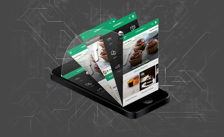
- Development of a mobile application. This is a very user-friendly solution. The application is developed for a specific software (IOS, Android). As a result, the user works with the most familiar to him functionality. However, to do this you need to download the application itself. And convincing the user that the need to visit this resource is so important to them that they need to install external software is a difficult task. Therefore, this solution is often used as an additional measure for the already existing full mobile version of the site;
- Adaptive design. If you think about why we need a mobile version of the site in principle, it is easy to come to the conclusion that this is a simplification in the first place for customers who have a PC and smartphone ONCE. Therefore, if a user visits the resource from different devices at different times, an adaptive design – the best choice. This is a more time-consuming solution. But it allows you to create a resource which automatically adjusts the visual picture to any screen width, and the user always sees the correct display.
Optimize the design
It’s not about adapting the design, but its simplification. The requirements for the mobile version of the site, in the first place, just in the simplicity and brevity. Bulky elements that serve only for the visual component: shadows, gradients – difficult to load and, in principle, are already out of fashion. The same effect can be achieved through a banal play with color.
The modern trend dictates the principles of minimalism, simplicity of lines and strict geometry of forms. Fancifulness and brightness will be perceived negatively. In addition, reduce or test all the pop-ups. Some of them may not work properly on certain mobile platforms. Which again, will cause user dissatisfaction.
Conclusion
One of the main criteria for a quality mobile version of the site is its trending relevance. It is necessary to keep a hand on the pulse, to respond promptly to any changes in the trend. After all, optimizing the mobile version is largely a pursuit of convenience for smartphone users. And they are usually the most progressive clients, who are very skeptical of resources that show signs of any obsolescence.


+ There are no comments
Add yours