So, you have finally decided that you need an email signature? Without a doubt, that’s a wise decision that can turn your emails into a powerful branding and marketing tool, which, in its turn, will help your business grow and succeed.
A well-designed signature that contains your contact details with links to your blog, website, landing page, and social media channels automatically turns into a free but effective source of traffic. It can eventually increase the number of followers and customers. However, you can’t get great results if you have a poor design.
In this article, we have gathered the top 10 best email signature examples to help you get started and avoid the common mistakes!
10 Best Email Signature Designs
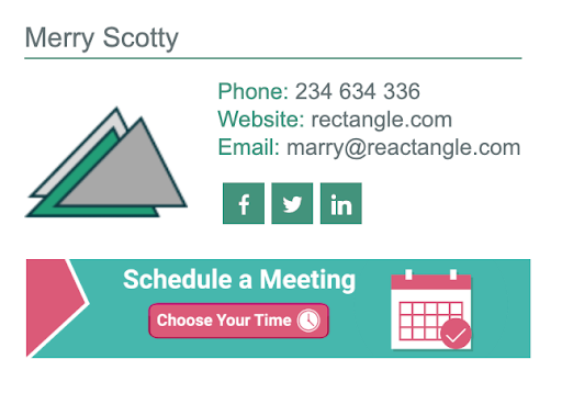
- Use of logo colors and promotional banners to help increase brand recognition and encourage the recipient to take a specific action. This example shows a consistent and appealing design. Pay attention to the use of banners and call-to-actions.

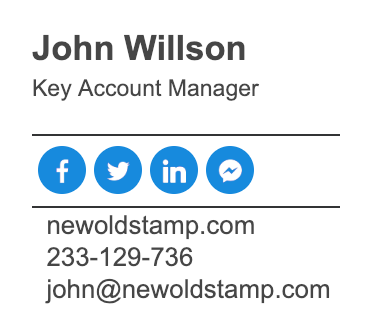
- Here is a good example of a simple design that shows how you can highlight the important information without distracting your recipients with complicated visuals and colors. It also shows how you can highlight the social media icons to encourage your contacts to follow you.

- Here is a classic signature that contains a professional photo. Such design looks classy and professional.

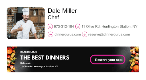
- If you are running a restaurant business, here is a good design to consider. It contains the author’s photo, shares contact details, and, most importantly, it offers the customer to visit a restaurant to try new meals. Meanwhile, the appealing pictures of new dishes make people want to try them.

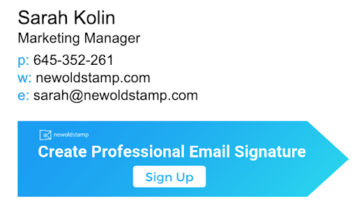
- Here is a smooth and simple design that makes a focus on the promotion of the company’s products. By keeping the overall design plain black and white, they drive attention to the marketing banner that encourages recipients to use the company’s services.

- Here is a great design for specialists in the fields of Consulting and Real Estate. Not how it shows the examples of apartments sold this month to capture the recipients’ attention.

- Another example in our list shows how you can add the map to tell your recipients about the location of your office. Meanwhile, it is clear and simple, provides all the necessary information, and contains the photo of the specialist.

- This example shows the correct use of dividers and visual elements in the design of an email signature. It also includes a disclaimer, which may be required by the law in some countries.

- If you want to create email signatures for all of your team members, you have to ensure that they look alike and highlight the style of your company. Here is a good example of corporate email signatures. Both pictures use the company’s logo colors and contain the same information. Such signature will boost your branding.

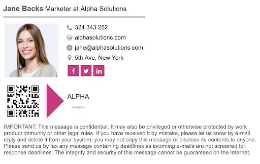
- The example showed below displays the correct use of a QR code in the email signature design. This is a good idea for your stamp if you want to enable your recipients to get in touch with you quickly and easily.

Top 10 Dos & Don’ts Of Email Signature Design
Now you have an idea of how your signature can look like. However, you can come across many pitfalls when designing yours. Thus, we want to give you a few additional tips on what to do and what to avoid in the design of your email signature.
Here are the main rules of a proper design:
- Confirm you design to the brand guidelines. If your corporate signature correspond to the image of your company, your brand will become more recognized. In addition, such stamps look professional and appealing to your target audience.
- Code it properly. With a poor code your signature may display incorrectly, which will ruin your company’s reputation. Thus, you should either hire a professional designer to create your stamp or do it using special tools that ensure its proper coding.
- Make it flexible. You have to ensure that your signature looks good on all email clients. Also, you have to make it mobile friendly, so that users of mobile devices could also see it.
- Keep it simple. Your design doesn’t have to be too complicated in order to attract attention. On the contrary, the simpler it is, the easier your recipients will perceive it. Stick to a classy, neat design to look professional and make your signature easy to read.
- Include social media icons. Social media are the modern way of sharing information that customers love. Give your audience a chance to learn more about your business by sharing your social media channels and engaging them to follow you!
- Give links to your blog or website. This approach will give you a regular and free source of traffic that can convert into more sales with some time.
- Include images. Add a professional headshot of yourself and a company’s logo. This will contribute to the brand’s recognition and increase the trust of your recipients.

